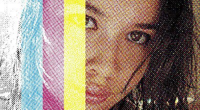
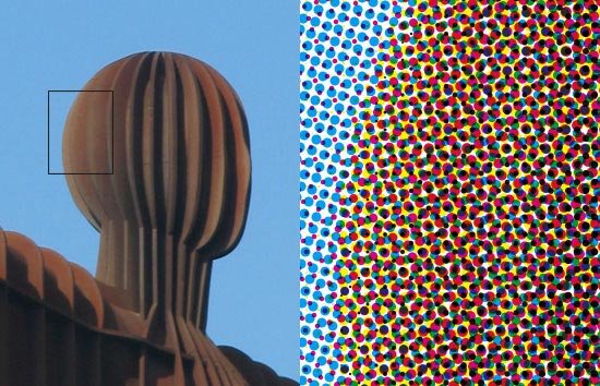
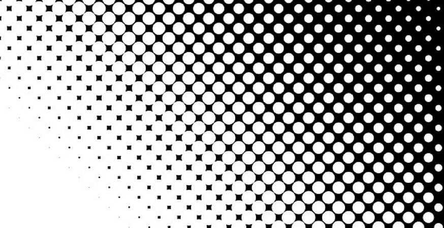
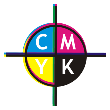
4-colour (or “4-color” in many US-derived software packages) describes the four primary colours of ink (“CMYK” – see below) that when combined into tiny little dots on a page can create the illusion of any colour the eye can perceive. This is in contrast to the three colours described by RGB (red green blue – see below), which are “light primaries” and only work on a screen.
In the days before digital printing machines such as the one we have at PrintChain, colour documents were actually run through the machine four times, one for each of the colours. This is still done for very large print runs such as newspapers or magazines, as it’s more cost-effective and faster to do.
For smaller scale jobs such as corporate materials, we use cutting-edge digital technology to print all four ink colours at the same time.
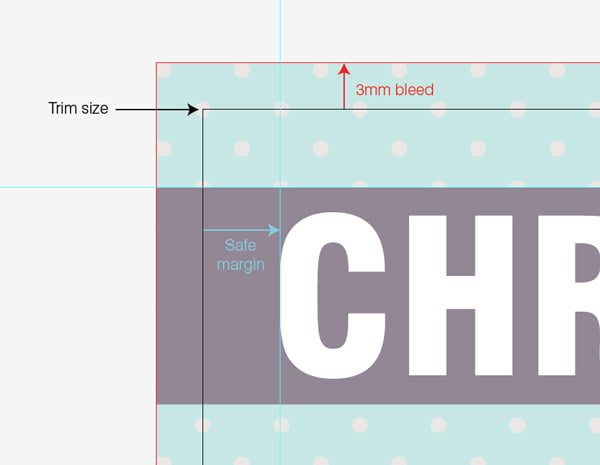
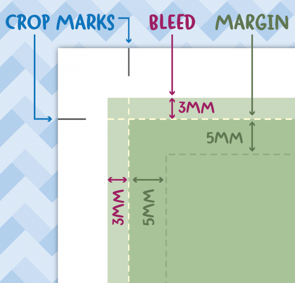
If you want your printing to go all the way up to the edges of the paper without any border or white space, you have to print the image larger than the size you want – on bigger paper – then cut it to size (known as “trim”). So “bleed” just means that the dimensions of the page design are larger than the finished object, and then the page itself will be cut within the bleed area. In other words you lose a bit of the extra printing outside the edge of the paper.
The exact positions of the trim area and the cut are indicated by crop marks (see below).
The middle of a book or leaflet – not including the front and back cover (or the other side of the front and back cover, which are often left blank).
Stands for Cyan Magenta Yellow blacK (the awkward “K” having been chosen to avoid confusion with Blue). This is the basis of the 4-colour process (see above): the four ink colours that are printed in varying proportions in little dots, to ‘fool’ the eye into seeing every possible colour.
To crop is to cut a print job to the desired size. The desired edge of the cut paper is indicated to the printer by crop marks, who will line up the guillotine with them in order to get as accurate a cut as possible.
This is particularly pertinent to jobs that require bleed (see above). Note that there is always a margin of error of 1 or 2 millimetres when cropping, which is why bleed needs to extend quite wide beyond the trim area, and why important parts of the print job such as text should remain within a margin of error.
A digital printer is very similar to what you have at home: unlike the 4-colour process, a digital printer pumps out all four ink colours at the same time. This means the machinery can be smaller, and the print runs are cost effective at smaller volumes – even down to a single sheet of paper.
We have a very efficient, modern digital printer on the premises that can output your job at high speed and very high quality.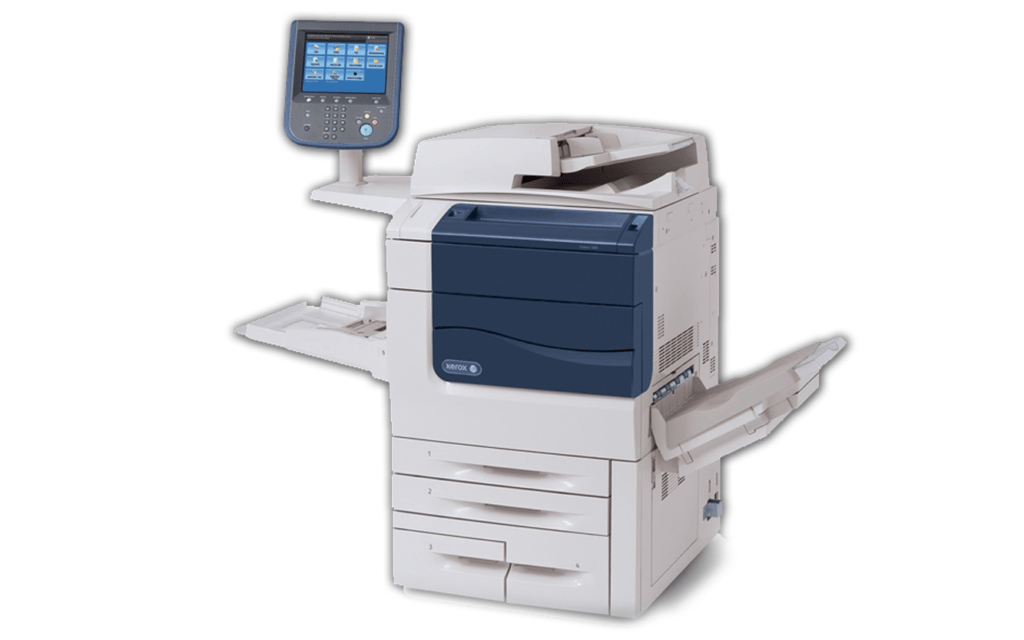
Dots per inch (DPI) is the standard printer’s terminology for how sharp your printed image is. It refers to how many dots are along one side of a square inch of your printing.
In other words if something is printed at 150 dpi (a standard home printer) then every square inch of the paper will contain 150 x 150 dots, or 22,500.
The general rule is that the bigger something is, the lower the resolution needed. If something is really big, like a billboard or an ad on the side of a bus, it might only be printed only at 15 dpi (and yes we can help you with that if you need though not in-house). A standard computer monitor is generally 72 dpi, or 5,183 dots per square inch – but on paper this would look rather blurry.
On the other end of the scale, most newspapers print at about 200 dpi, glossy magazines or art books at 300 dpi; the maximum that most printing systems can cope with is 1,200 dpi but this is rarely used.
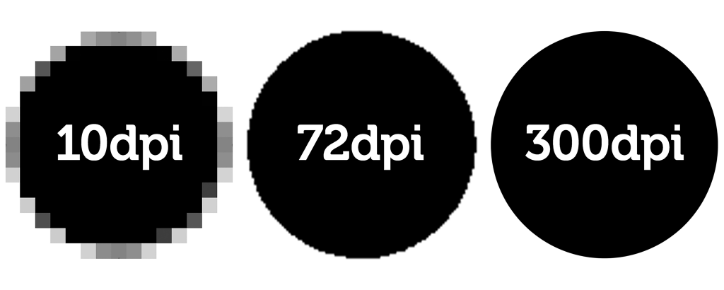
Generally we advise a minimum of 150 dpi for your professional office jobs, and 300 dpi for something fancy such as a glossy brochure or magazine.
Finally – why inches not metric? Only tradition, and the fact that early DTP software was developed in America.
“DTP” stands for desktop publishing. I refers to the revolution in printing techniques that took them from being the preserve of skilled tradesmen working with metal type (and in later years Letraset transfers and photographic film), and put it in the hands of the consumer and technical specialists via computer software.
When you design something in Microsoft Publisher, Adobe InDesign, or even Microsoft Word, you’re working with DTP. If you are doing your own DTP, don’t forget to see our guide to sending your files to your printer.
 A font is the typeface you have chosen for your print job. Famous fonts include Times New Roman, Helvetica, and Comic Sans.
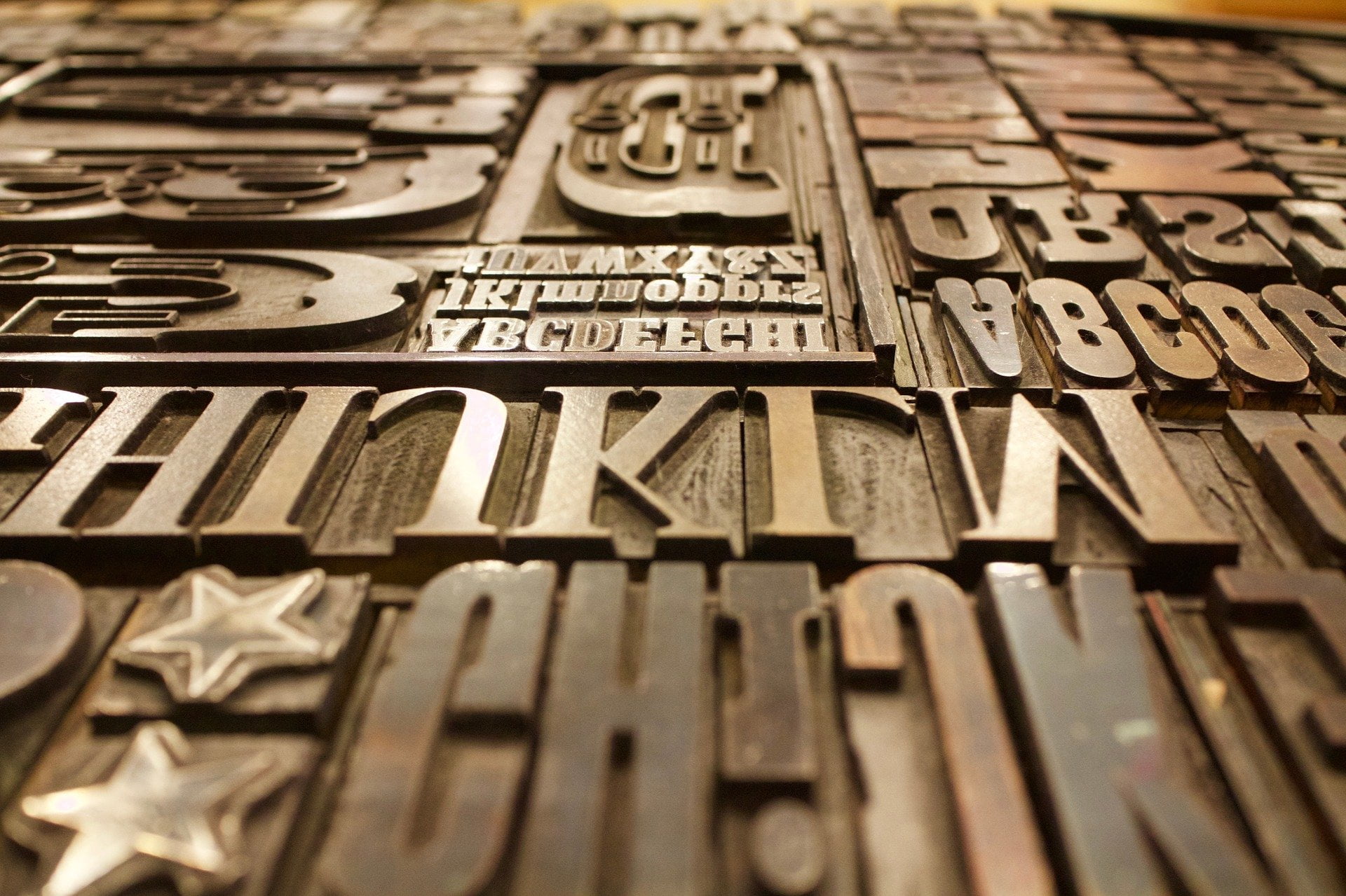
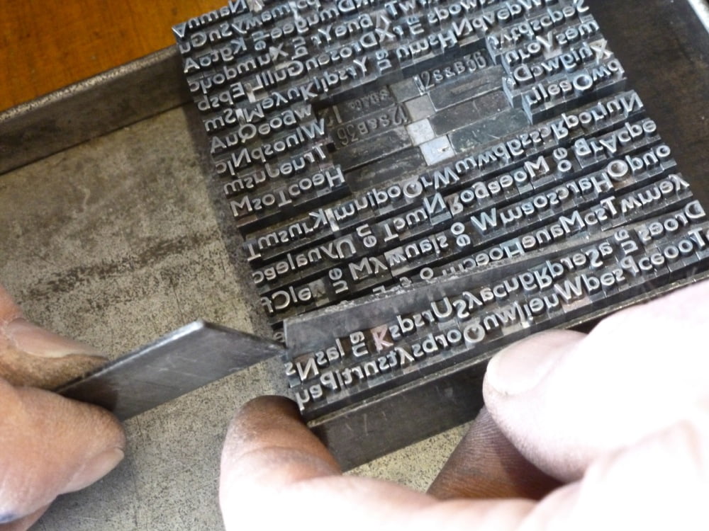
The word is related to the word “foundry”, as in the early days of printing, letters and numbers were physically created from moulds using molten lead – see the picture at the top of this page.
These days fonts are vector files that contain instructions that tell your computer how to draw the letters, numbers, and punctuation in your chosen typeface.
Many printed materials use more than one font, but we recommend taking expert design advice on how to combine them to look good.
Also, when you send a print job to us, make sure to include the font files you’ve used, particularly if they are uncommon fonts. Without them, we can’t print the font correctly.
The art of making stuff look good on page (and these days, on screen). Contact us if you’d like us to design your materials so that they please the eye – or indeed if you’d like a website designed – such as this one!
This refers to printing in black-and-white so that an image still has depth of tone. It uses a dot-type process (see CMYK) but does so only with black ink, just by varying the size of the black dots.
“Grammes per square metre”. This is how heavy and thick your paper is. Normal office A4 that you use in a regular printer is 80 gsm. However for other materials we can print at up to 350 gsm, which is a decently thick card.
The machine that cuts your print job to the correct size. (Or your French royal family to the wrong size.) Quite often print jobs are printed bigger than necessary to account for bleed, and then cut to size. Our large digital printer does everything at SRA3 (“supplementary raw format A” – at 320 × 450 mm slightly bigger than A3 to allow for bleed) and then we will customise it for you with our sharp cutter.
This refers to the technique whereby depending on their shape, some letters can slightly intrude into each other’s space, which makes them look much more aesthetically pleasing. The term is derived from the Latin word for “hinge”.
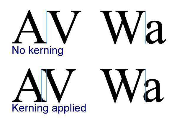
Kerning used to be a skill only practiced by typesetters with decades of experience. These days it’s usually automated via DTP software, though occasionally a graphic designer needs to intervene and fix kerning that doesn’t look quite right.
To tightly cover your document with plastic and seal it. We provide lamination services.
The gap between lines in text. The term was because little strips of lead were originally placed between lines of text to increase the gap between them.
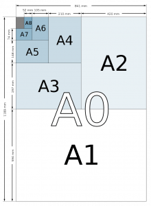 In Europe we tend to use the A paper series, though there are also B and C series too.
A0 is the largest paper you can get in the series: it’s 841 x 1189 mm.
A3 is a standard poster size at 420 x 297 mm.
A4 is the one you will probably be most familiar with: 297 x 210 mm.
Why these strange measurements? Well, for each paper size, if you fold it in half you will automatically get the next one in the series. A3 folded becomes A4, etc. It’s part of the Golden Ratio, or the famous Fibonacci sequence.
Fun fact! Toilet paper sheets in Germany aren’t square: they’re A6.
 These are little targets put on the side of your print job to ensure that for each pass through the printing machine in a 4-colour process, the little dots line up properly. The technician uses a lens with cross-hairs that s/he can use to perfectly align the registration mark, and therefore the paper.
You may sometimes see these accidentally left on the side of a newspaper or magazine page if it hasn’t been cropped properly.
Of course registration marks are no longer relevant when a digital printing machine is being used, like the one we use at PrintChain.
This is the general term for how much detail/sharpness there is in an image, and relates to how densely packed the little dots are that the image is printed at – or the density of the pixels on your computer or smartphone screen or TV. See DPI.
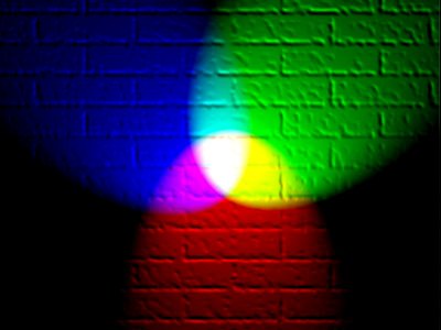 These are the “light primaries” that work in a similar way on a screen to CMYK on paper: using differing combinations of Red, Green, and Blue, almost every colour perceivable by the human eye can be recreated. If you have a graphic or a document for print that is in RGB, it must be converted to CMYK in order to print it. We will always check that the conversion hasn’t altered the colours before they print – a few years ago this used to be more of a concern, but the software is much better at doing this nowadays.